WeEat
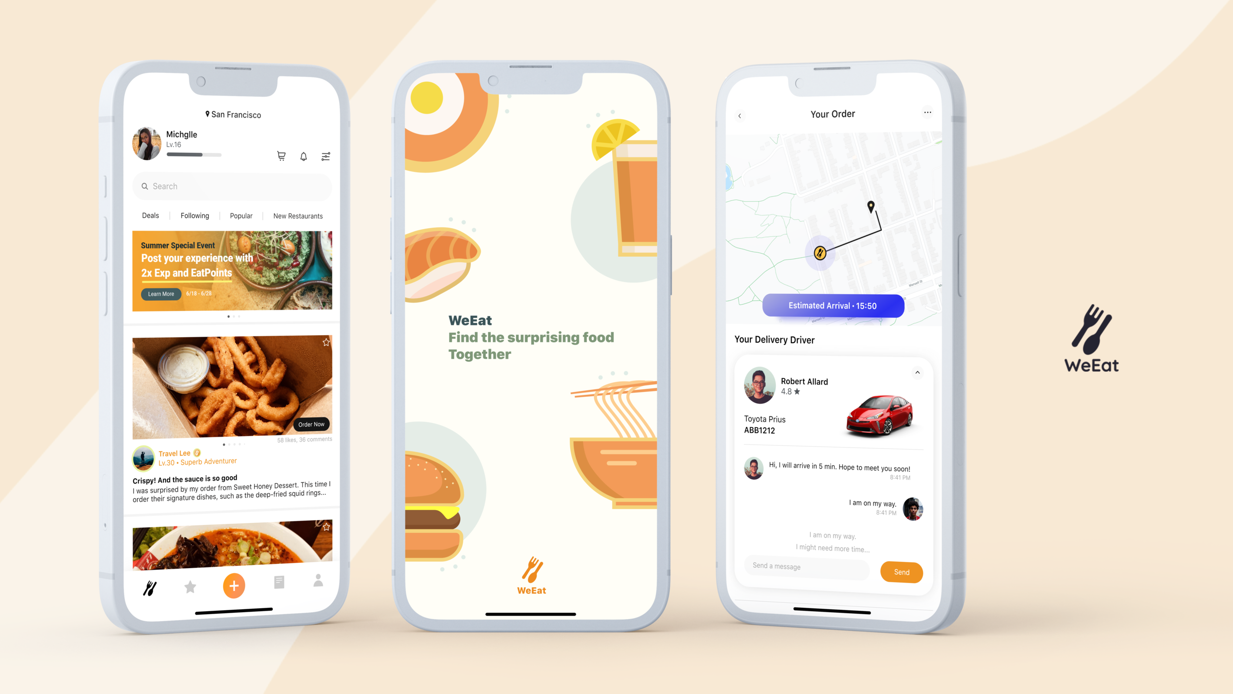
A food delivery community app for discovering restaurants
Team member
Kunwei Jin
Project time
11/2021 - 01/2022
PROJECT OVERVIEW
Background
This is my personal project outside of school. And the primary motivation of this project occurred when I was frustrated with looking for new restaurants when I wanted to try something new, either dine-in or delivery. It took many steps to select a restaurant when I had no idea what type of restaurants I wanted to try.
Objectives
Design an app that primarily helps users explore new restaurants with limited service of food delivery.
Provide a platform that allows and motivates users to share their experiences on the restaurants they like
RESEARCH PLAN
Research Goals
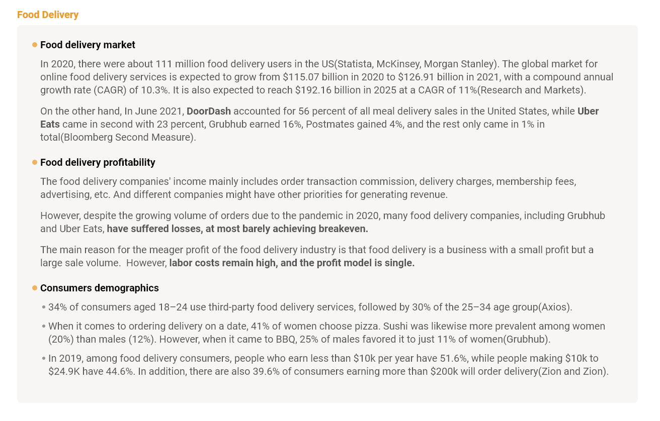
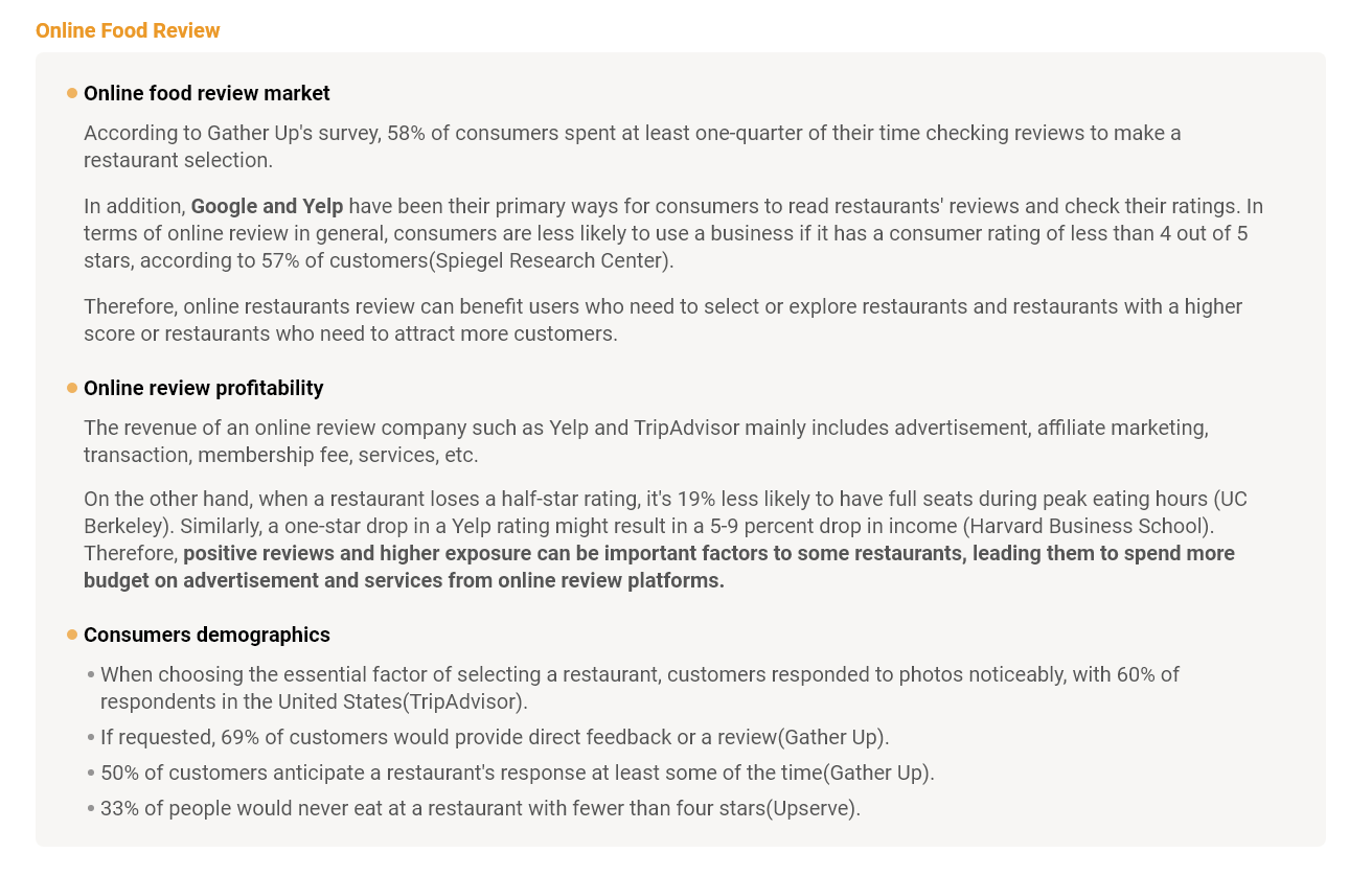
Identify the opportunities and feasibility of the current markets of food delivery and online
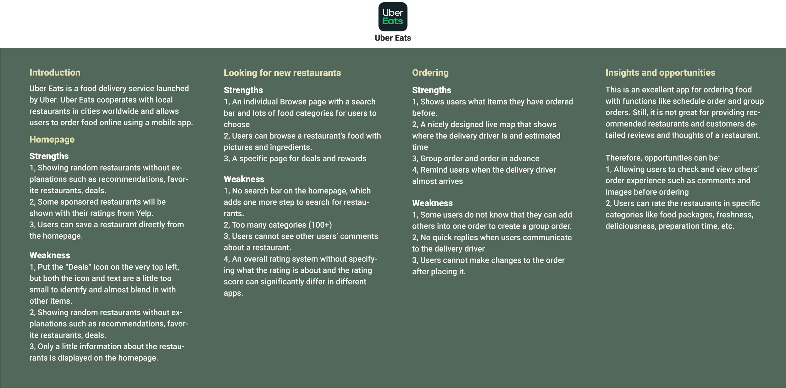
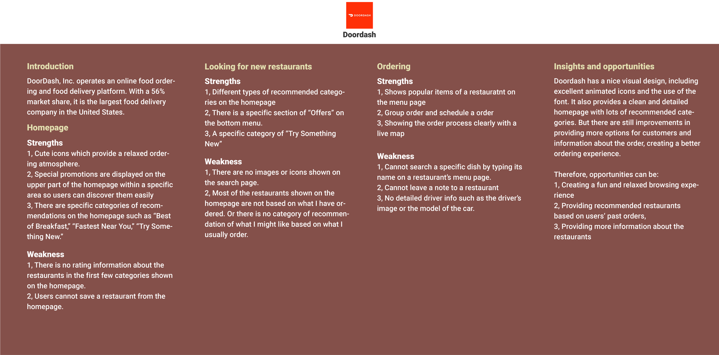
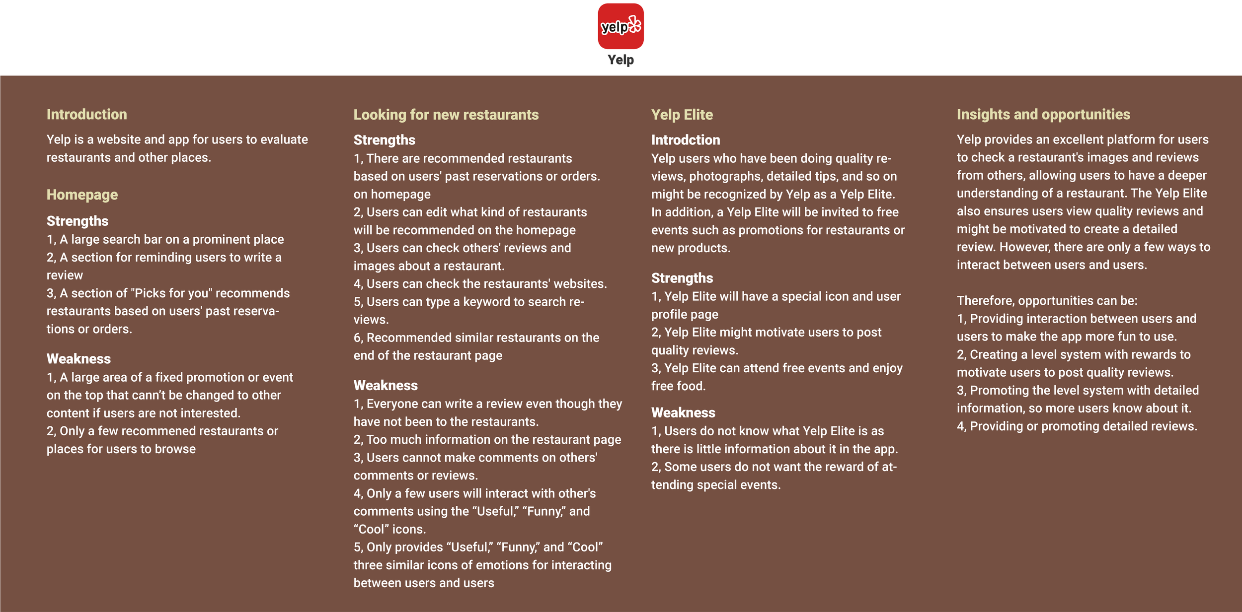
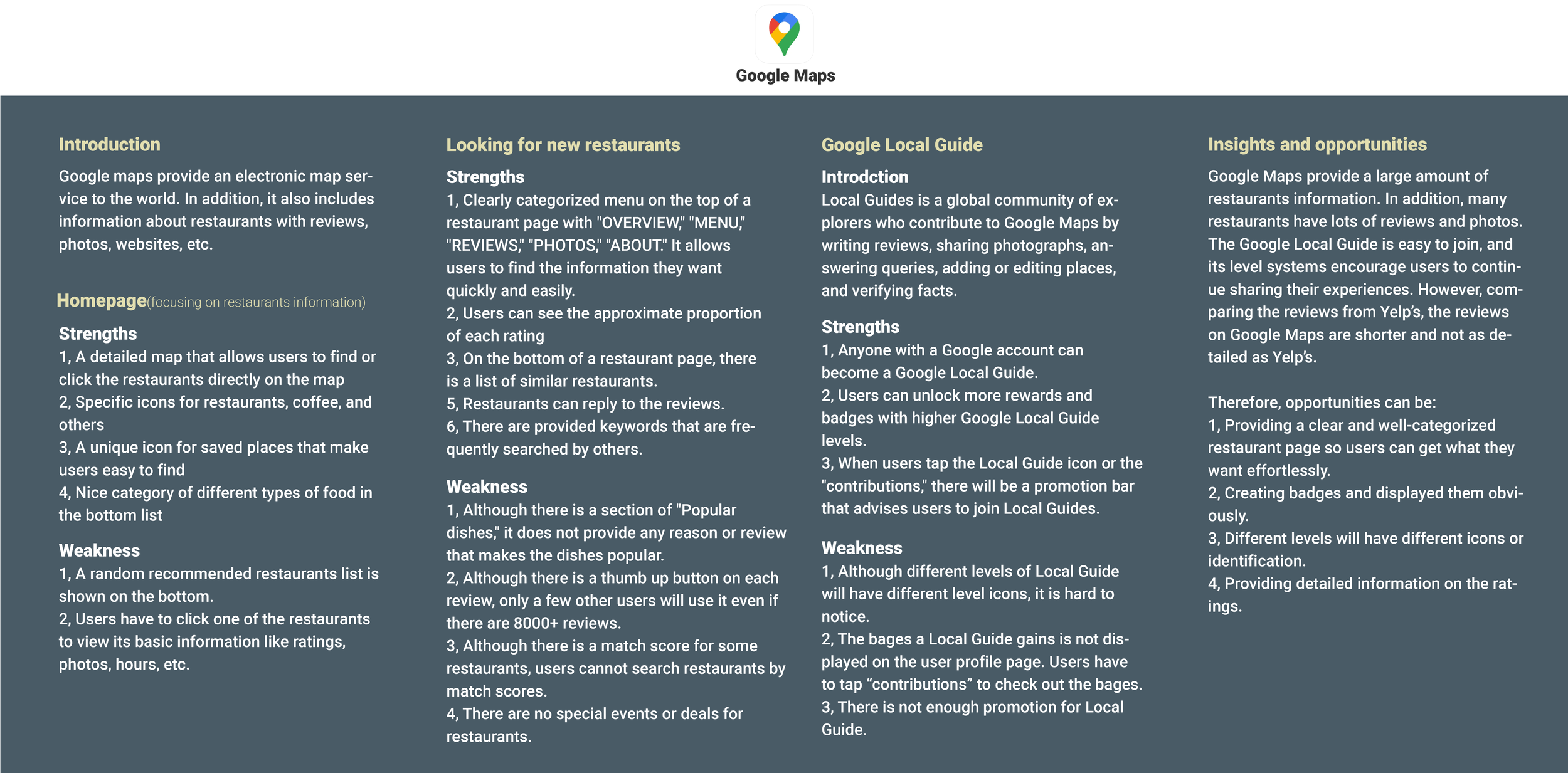
Learn about competitor apps that users are using for ordering food and looking for new restaurants
Understand why and how users are looking for new restaurants
Identify negative user experiences and problems during the exploring and ordering process
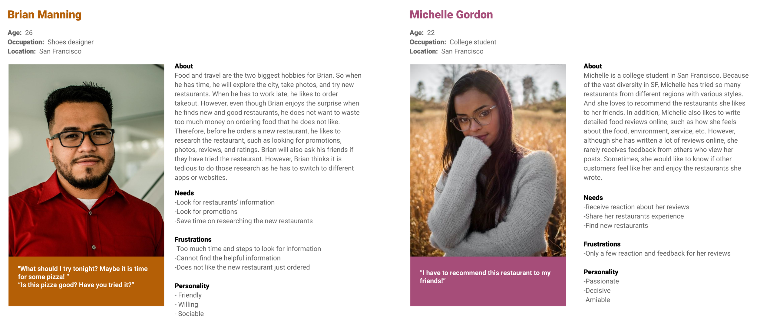
Identify the target audience for the app
Methodologies
Secondary Research (Marketing research, Competitive Analysis)
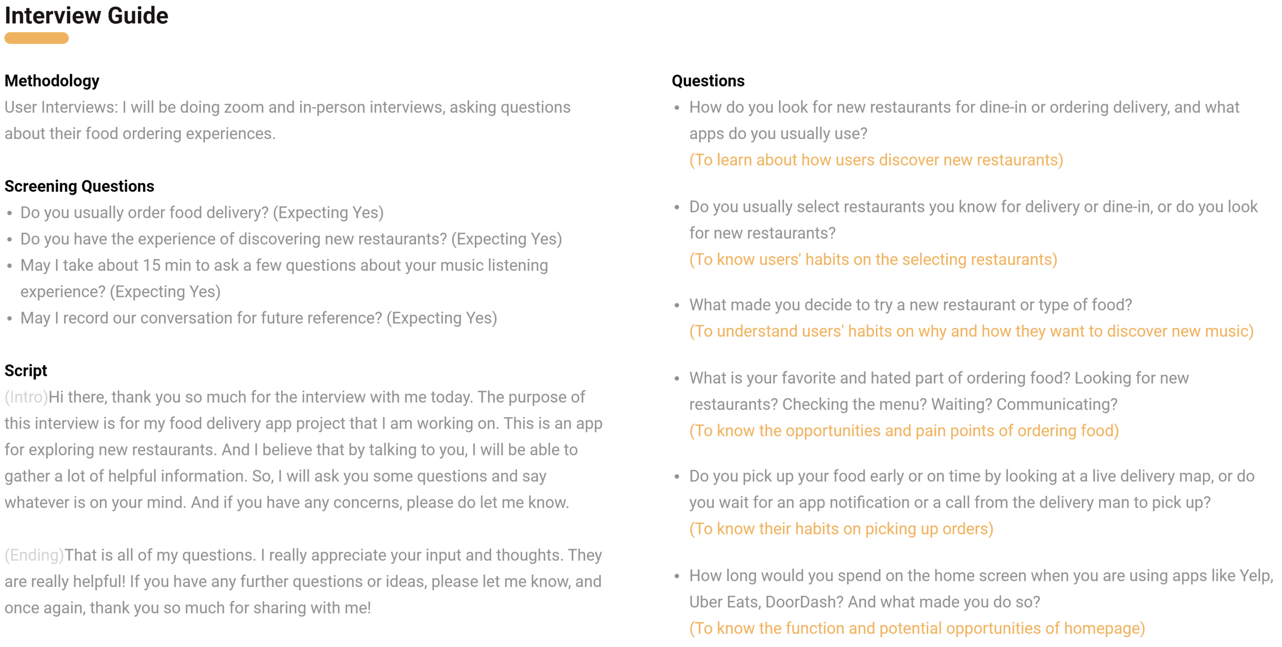
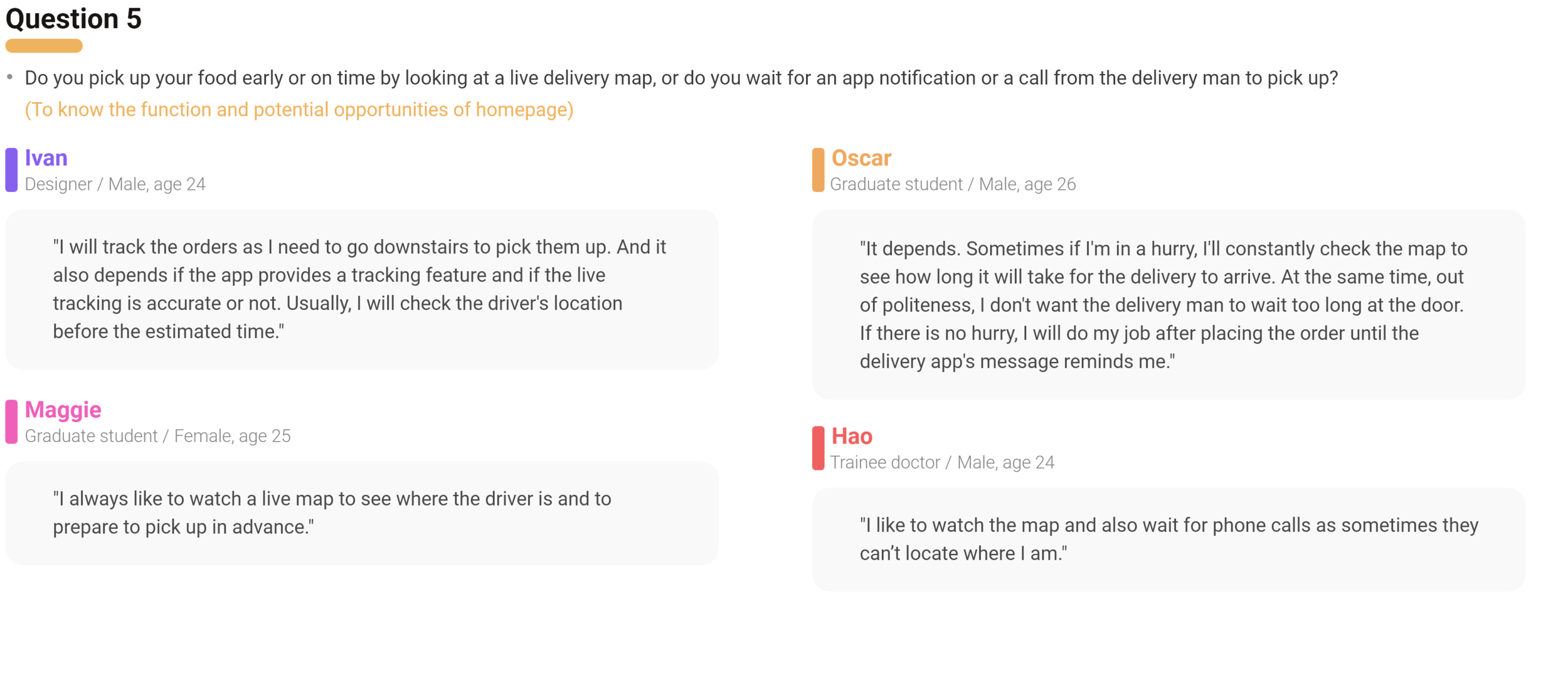
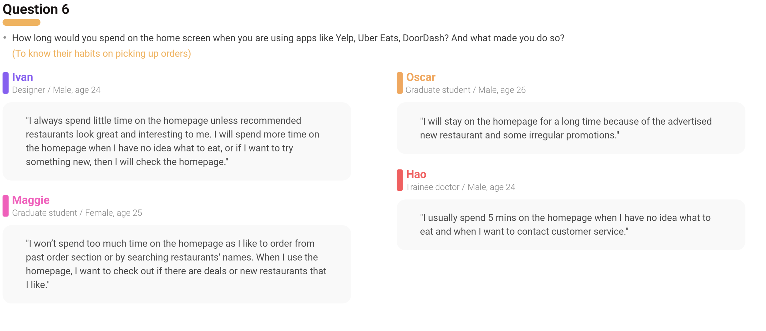
Primary Research (User Interview)
Secondary Research
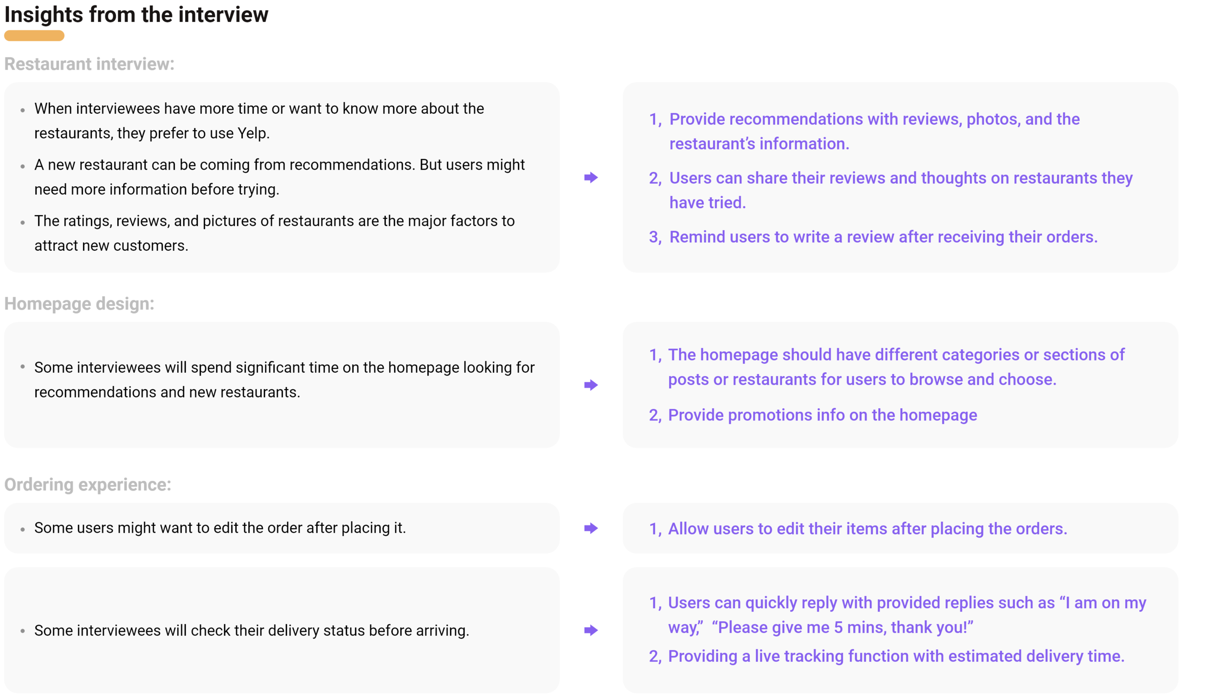
Primary Research
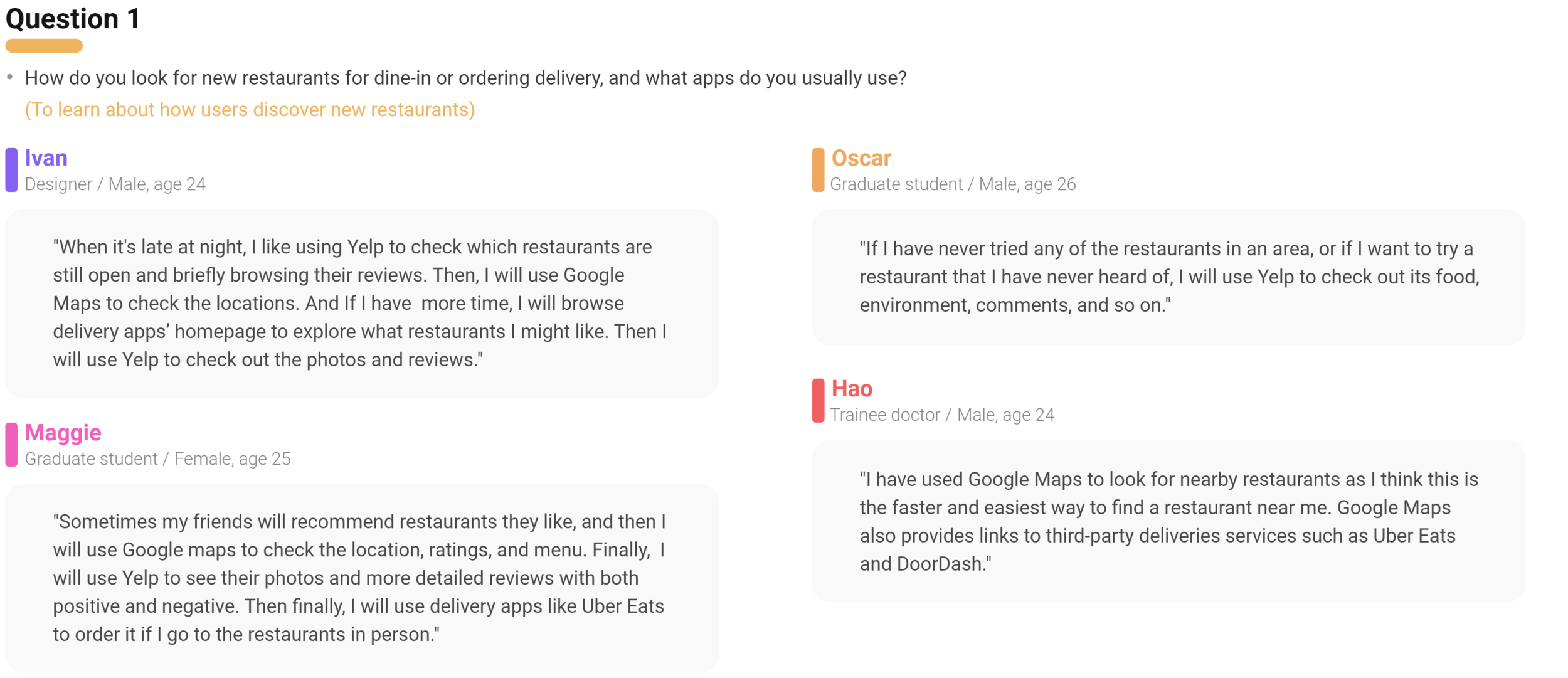
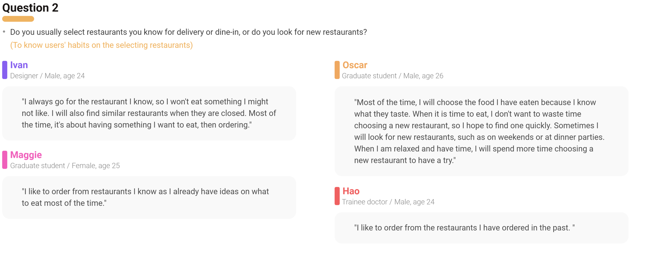
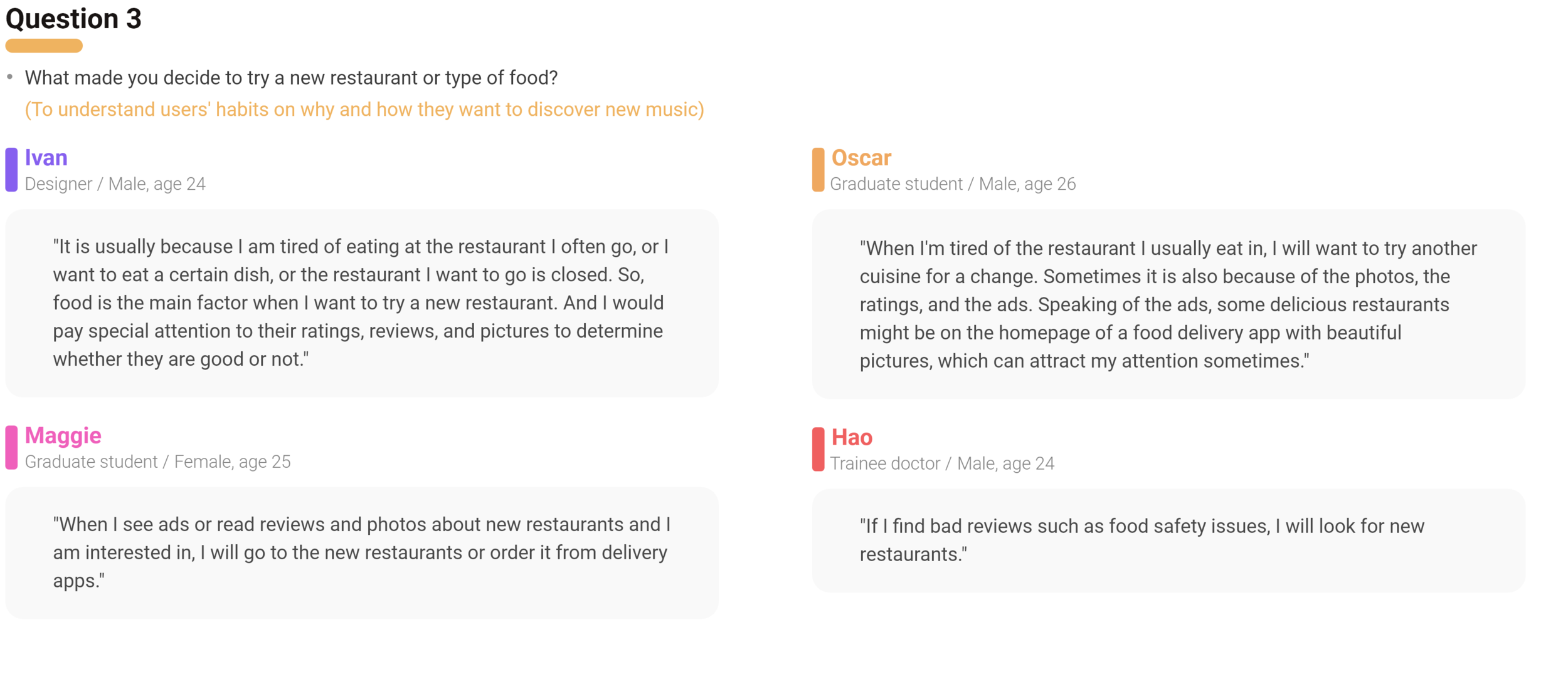
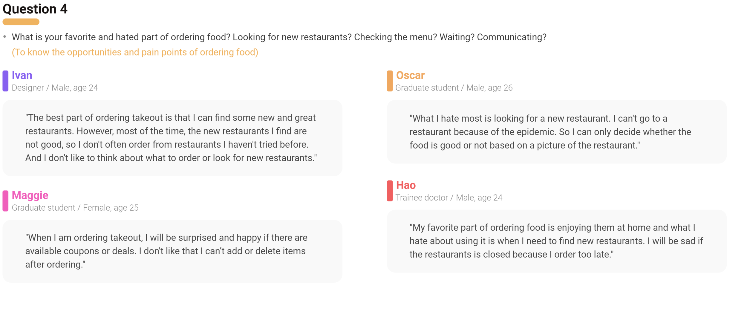
Summary Map
PERSONA
BRAINSTORMING
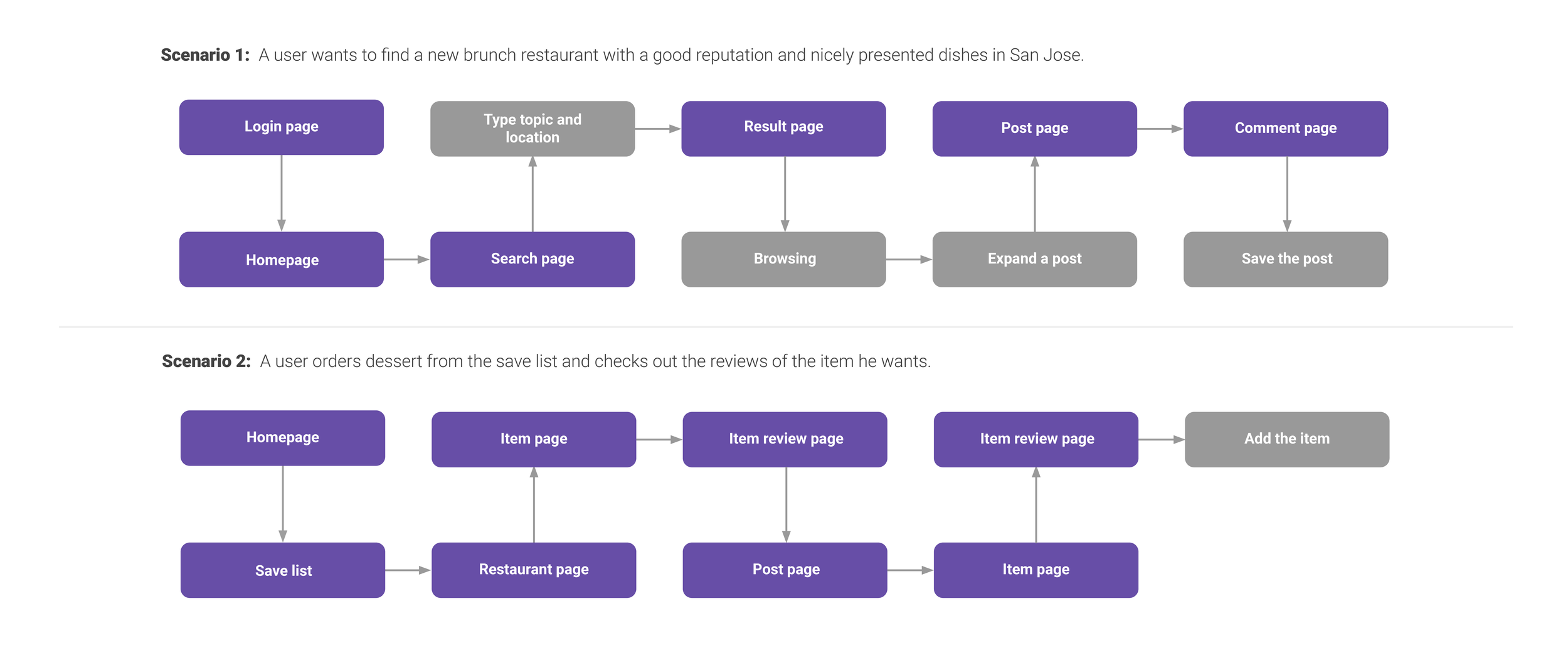
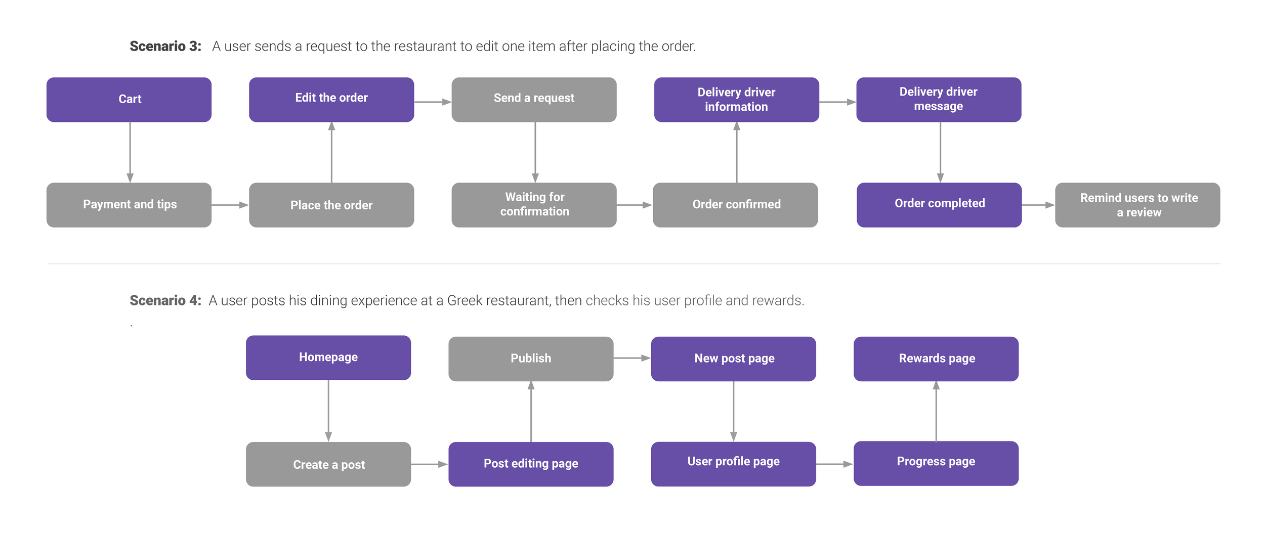
TASKS FLOW
THE PROCESS
WIREFRAME SKETCHES
LOW-FIDELITY WIREFRAMES
MEDIUM-FIDELITY WIREFRAMES
PROTOTYPE TESTING
Test Scope
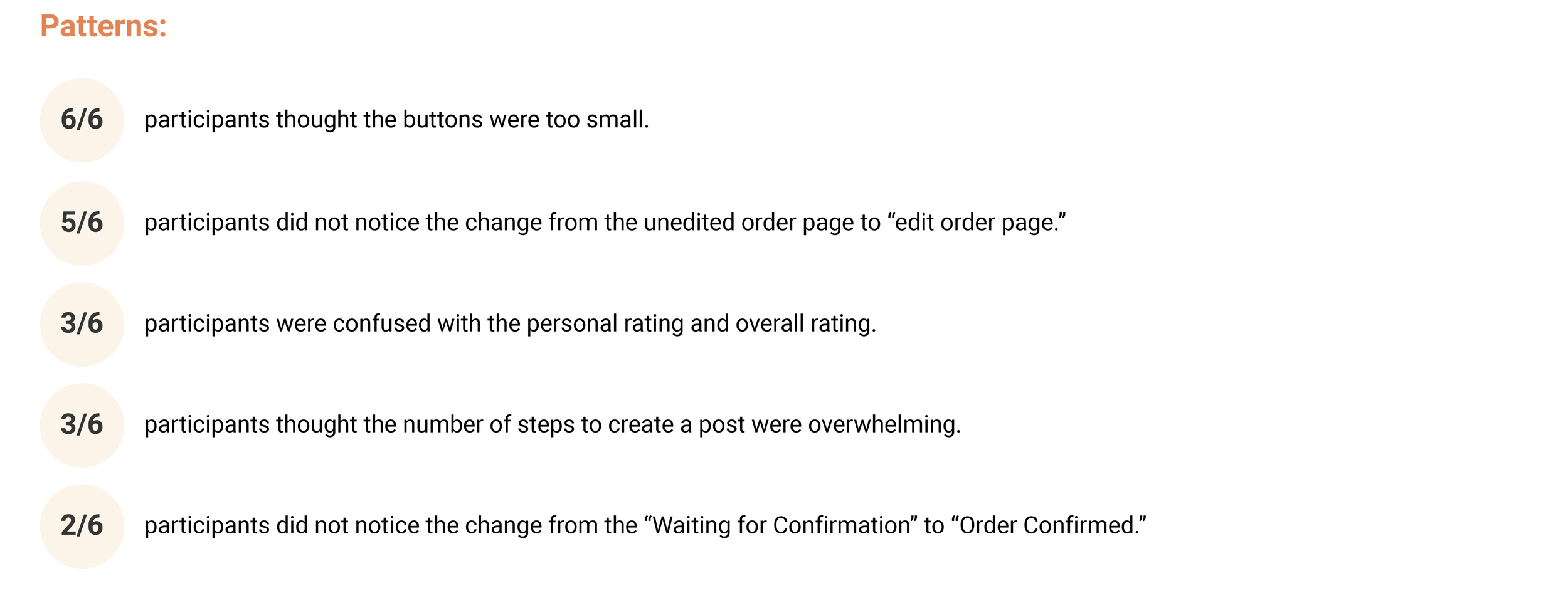
The usability test will be testing all scenarios from the Mid-Fidelity Wireframes of the App. This testing will be focusing on discovering issues, opportunities, improvements, and such.
Goal
Test if users can complete each scenario.
Identify the usability problems such as confusion, misunderstanding that users encounter.
Identify visibility and readability problems.
How satisfied users are with the process.
Document the result and identify finds and insights to generate future improvement.
Methodology
Moderated remote usability testing
Moderated, in-person testing
Participants
6 Participants who have experience of food online delivery and posting reviews.
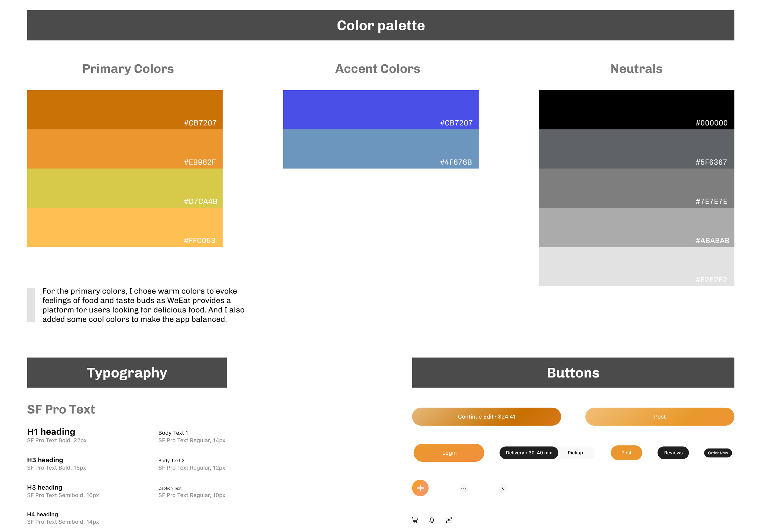
UI STYLE GUIDE
THE SOLUTION
HIGH-FIDELITY WIREFRAMES
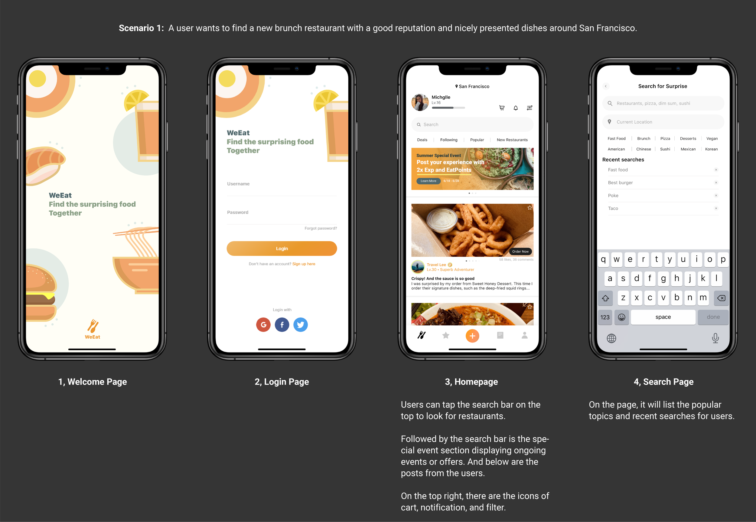
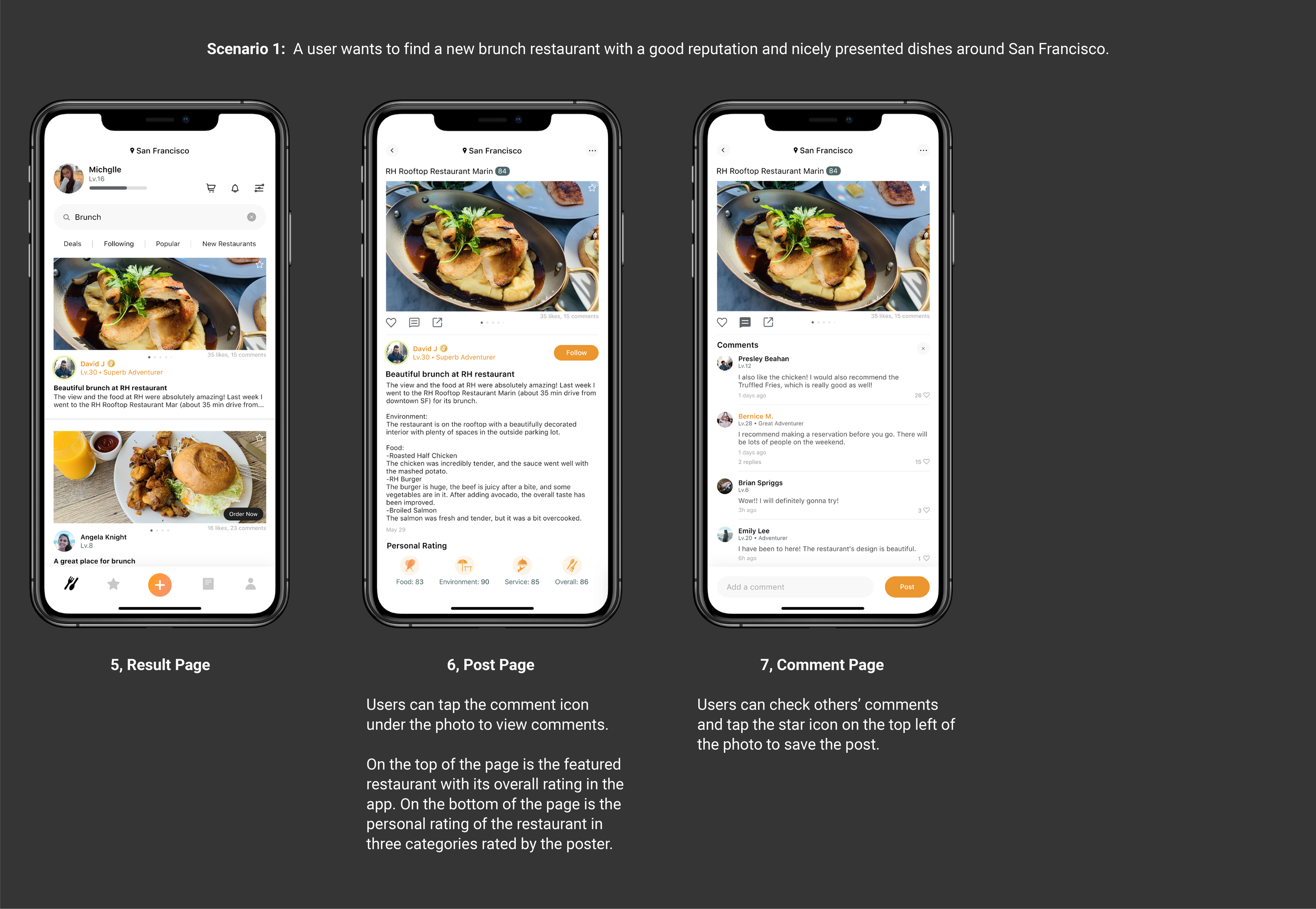
Scenario 1:
A user wants to find a new brunch restaurant with a good reputation and nicely presented dishes around San Francisco.
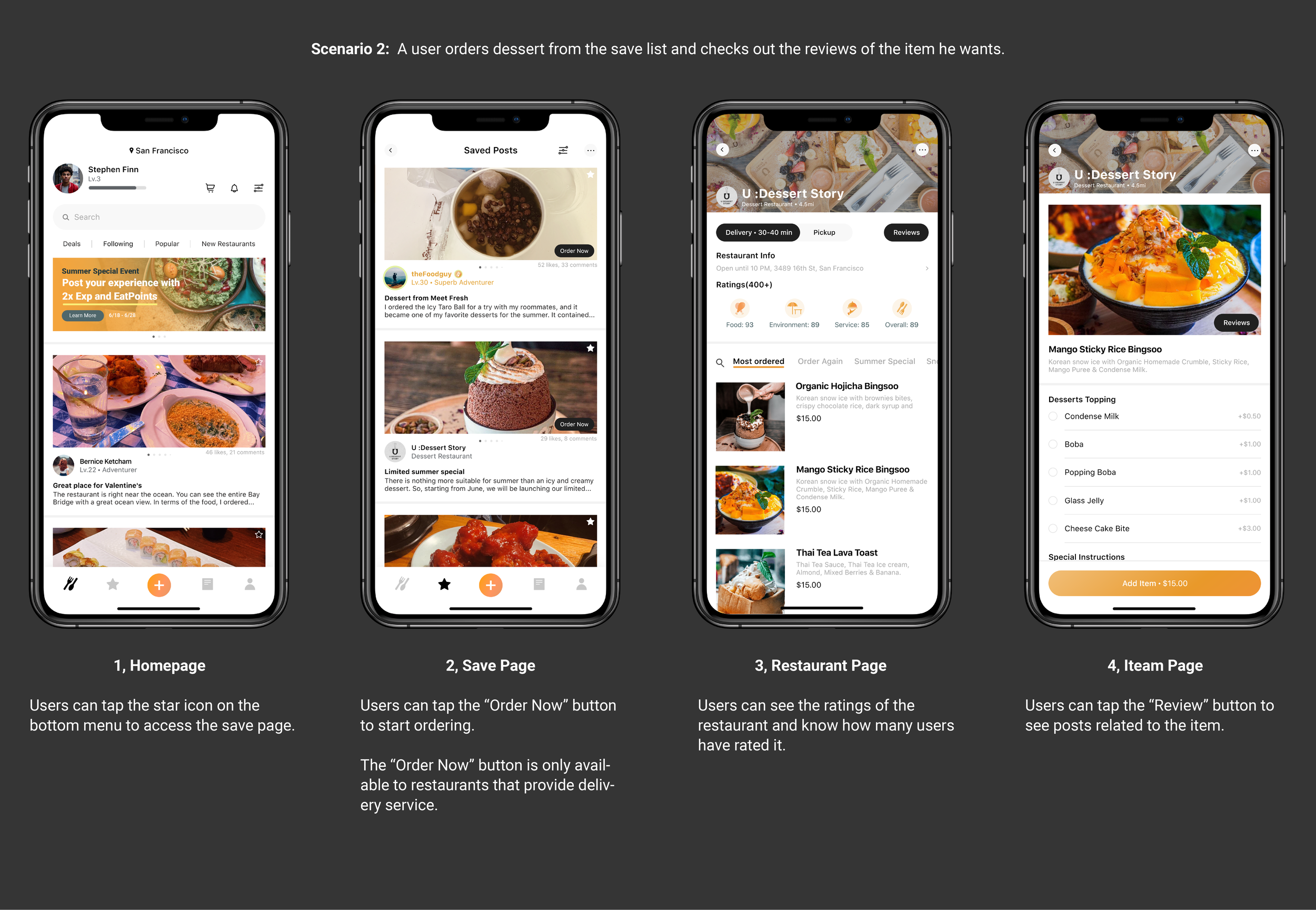
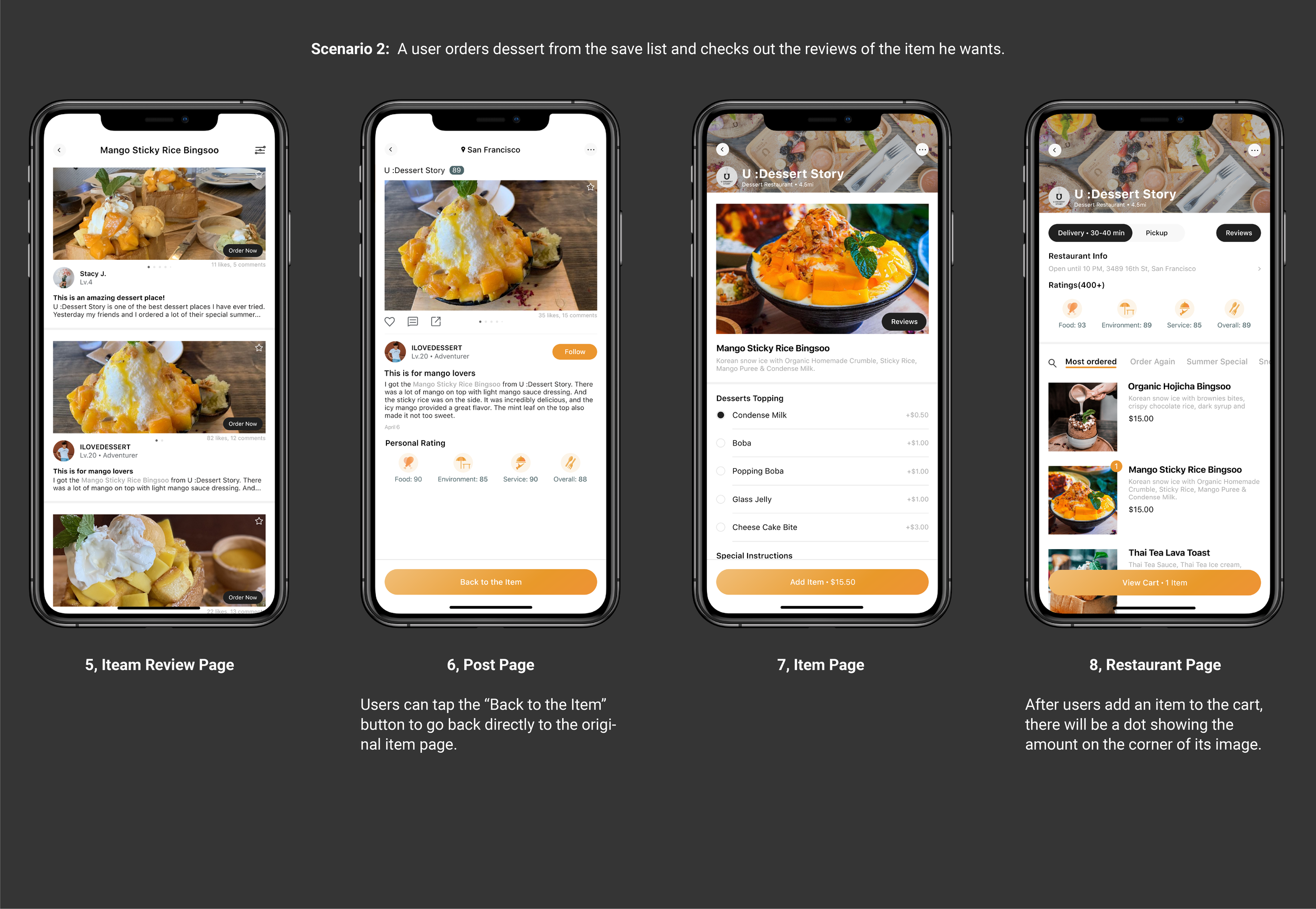
Scenario 2:
A user orders dessert from the save list and checks out the reviews of the item he wants.
Scenario 3:
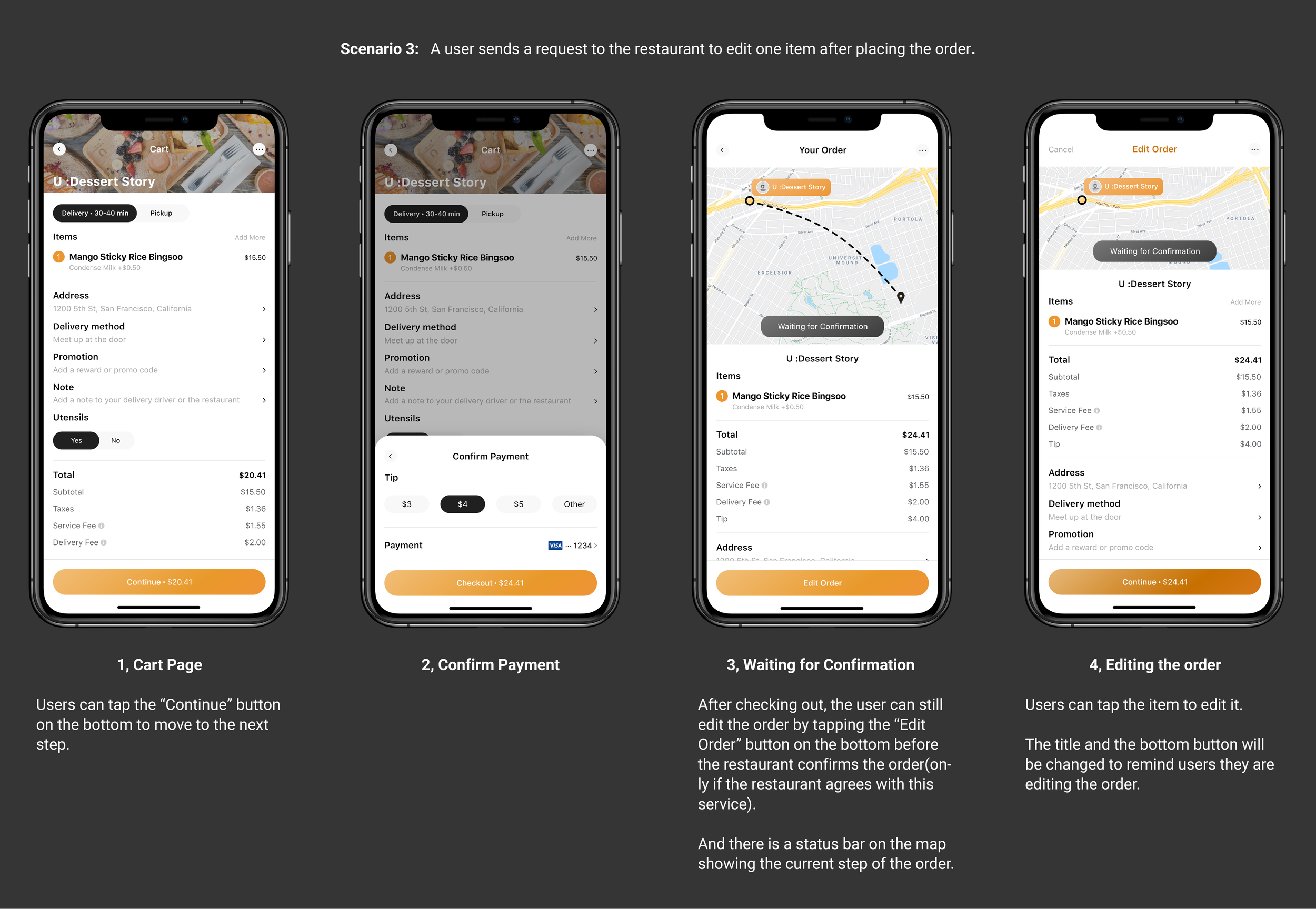
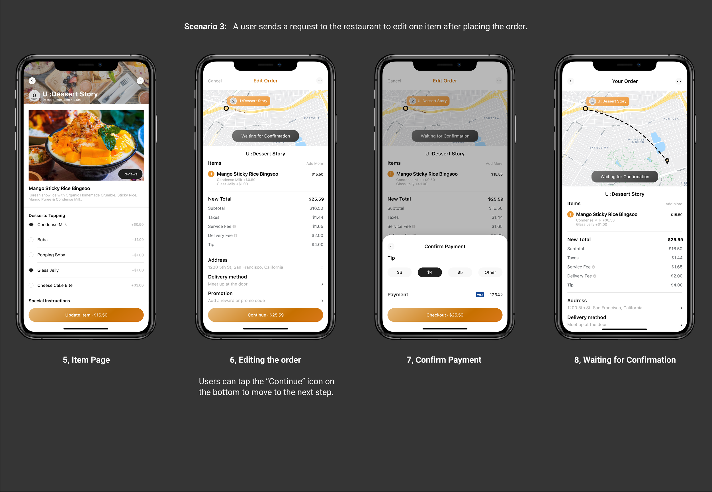
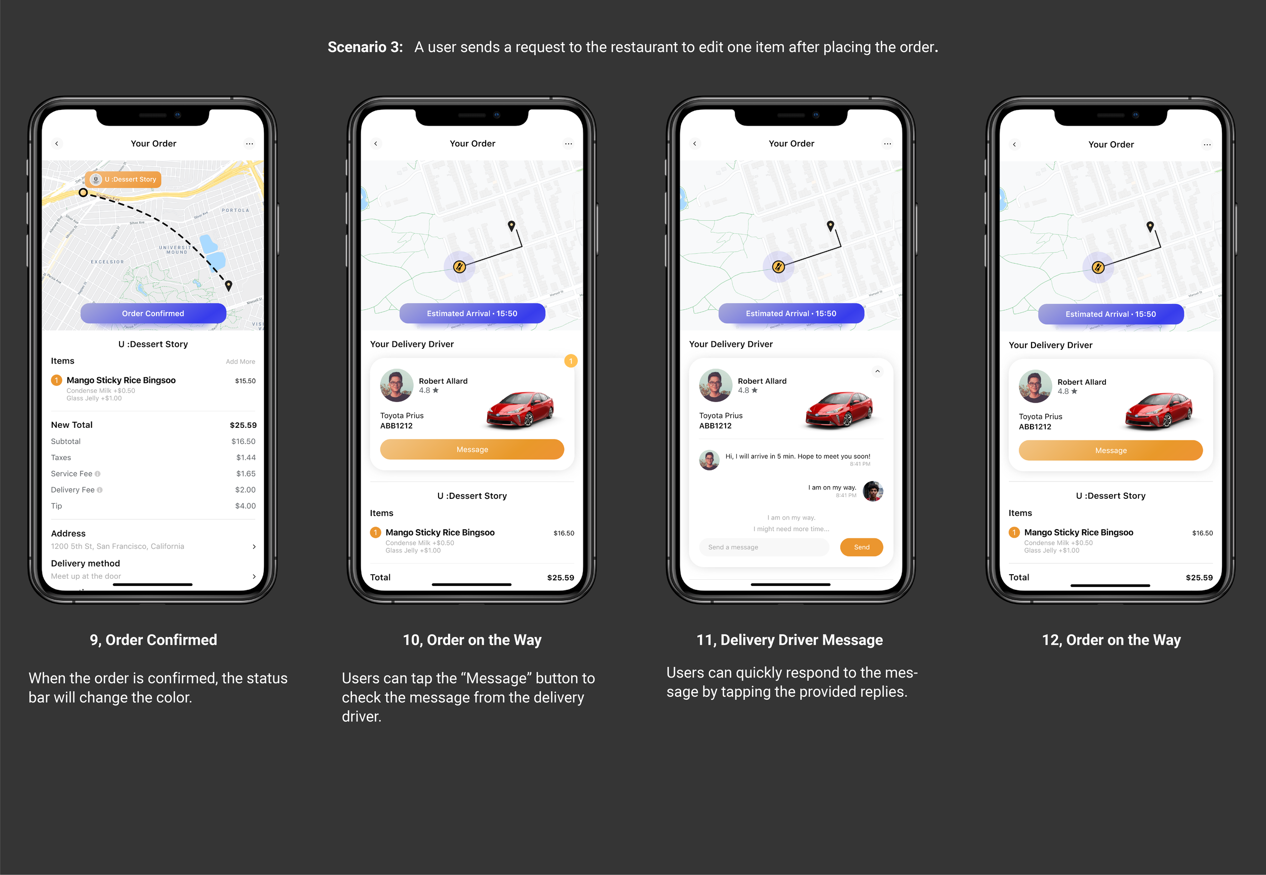
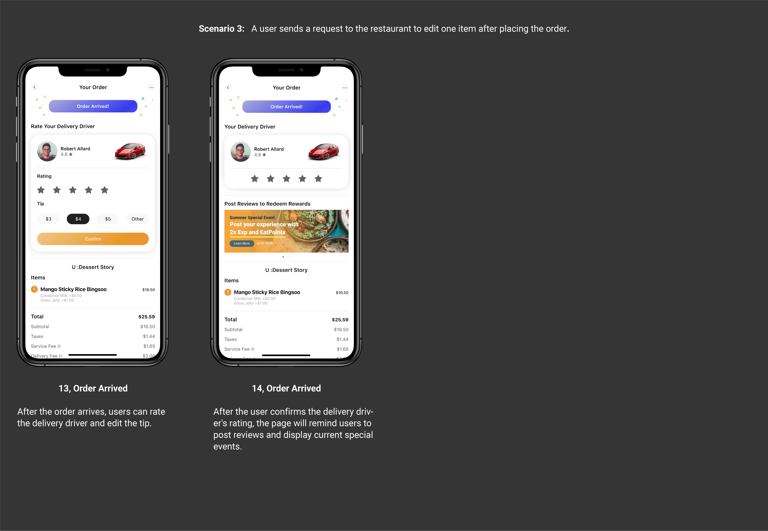
A user sends a request to the restaurant to edit one item after placing the order.
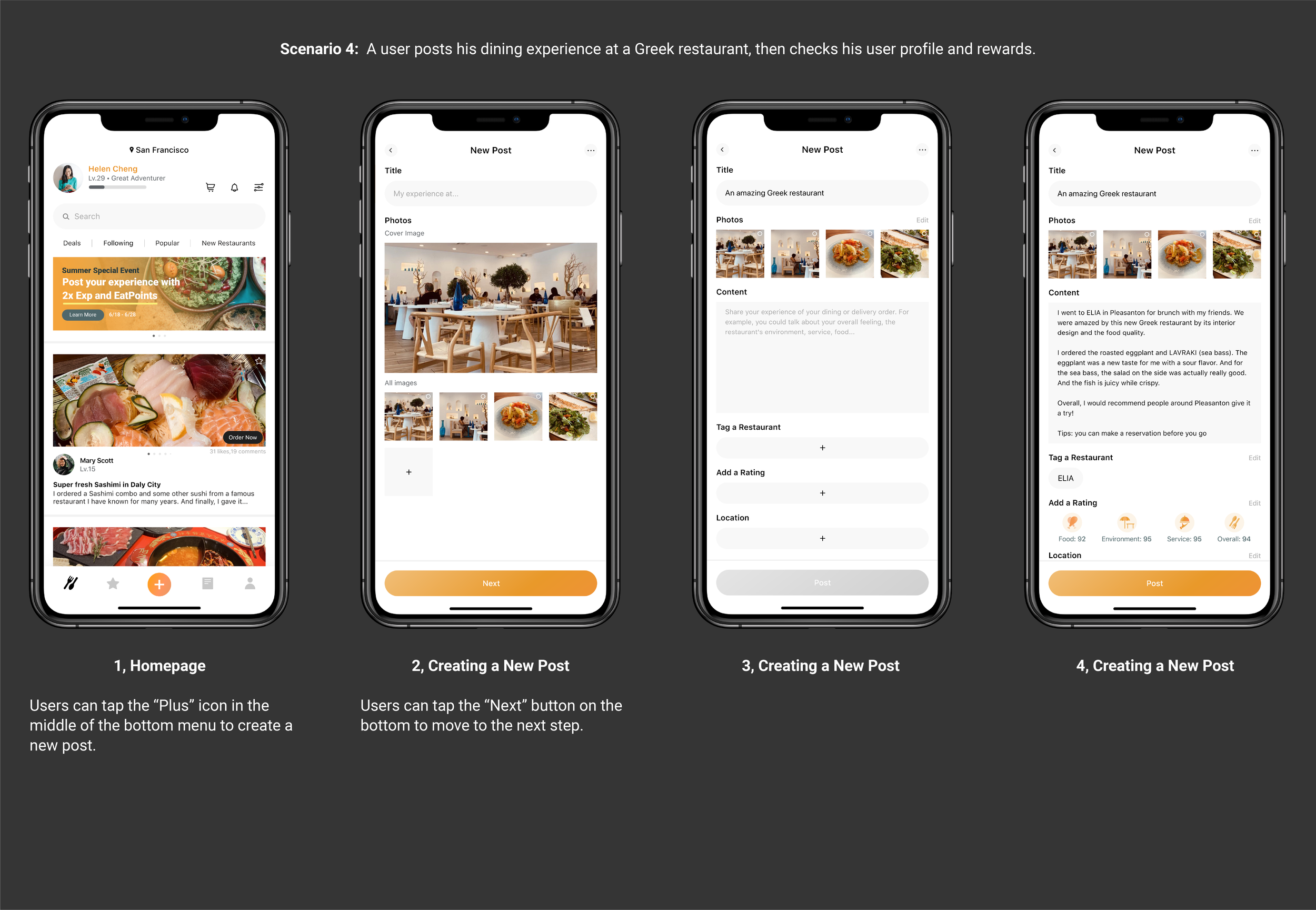
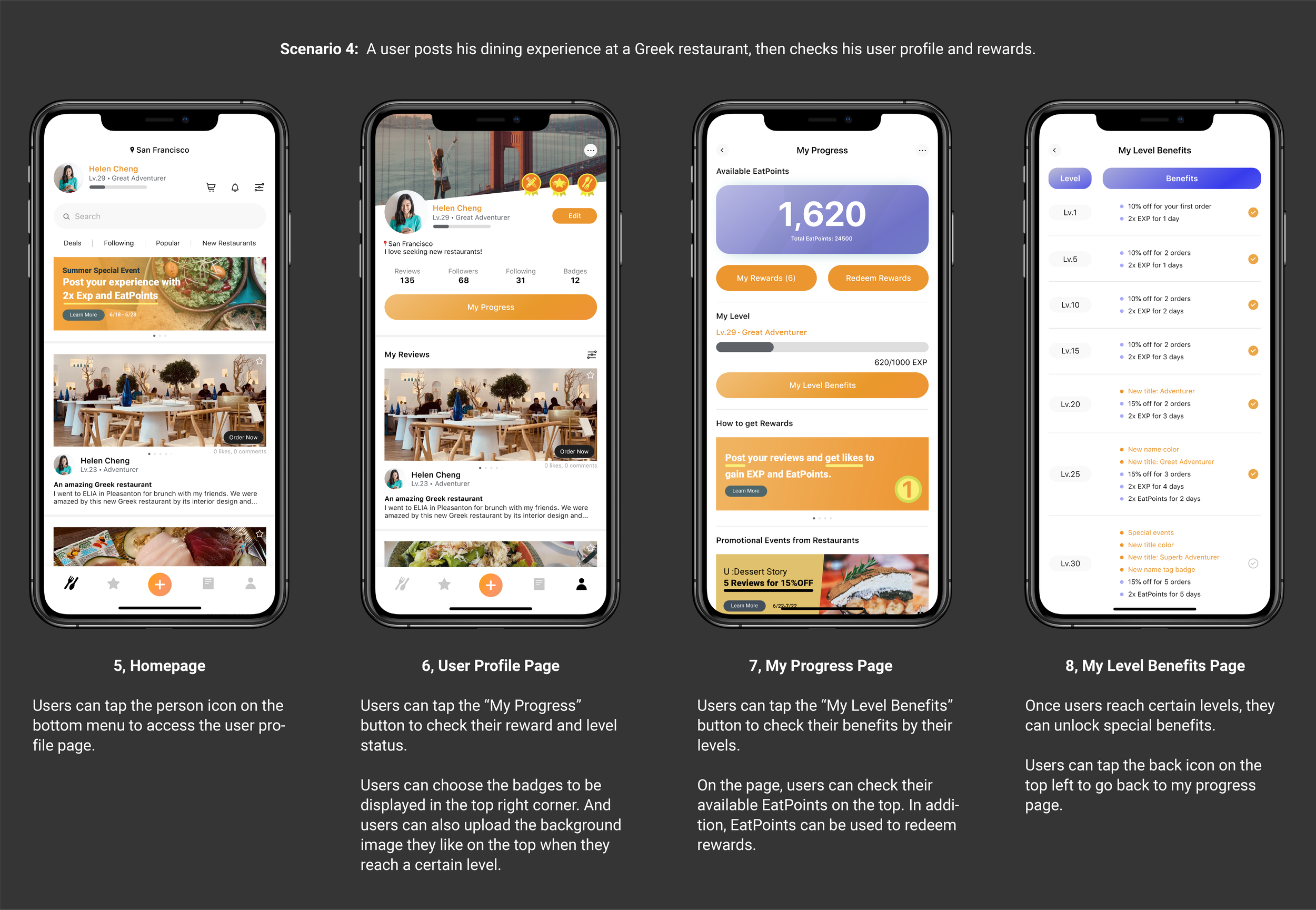
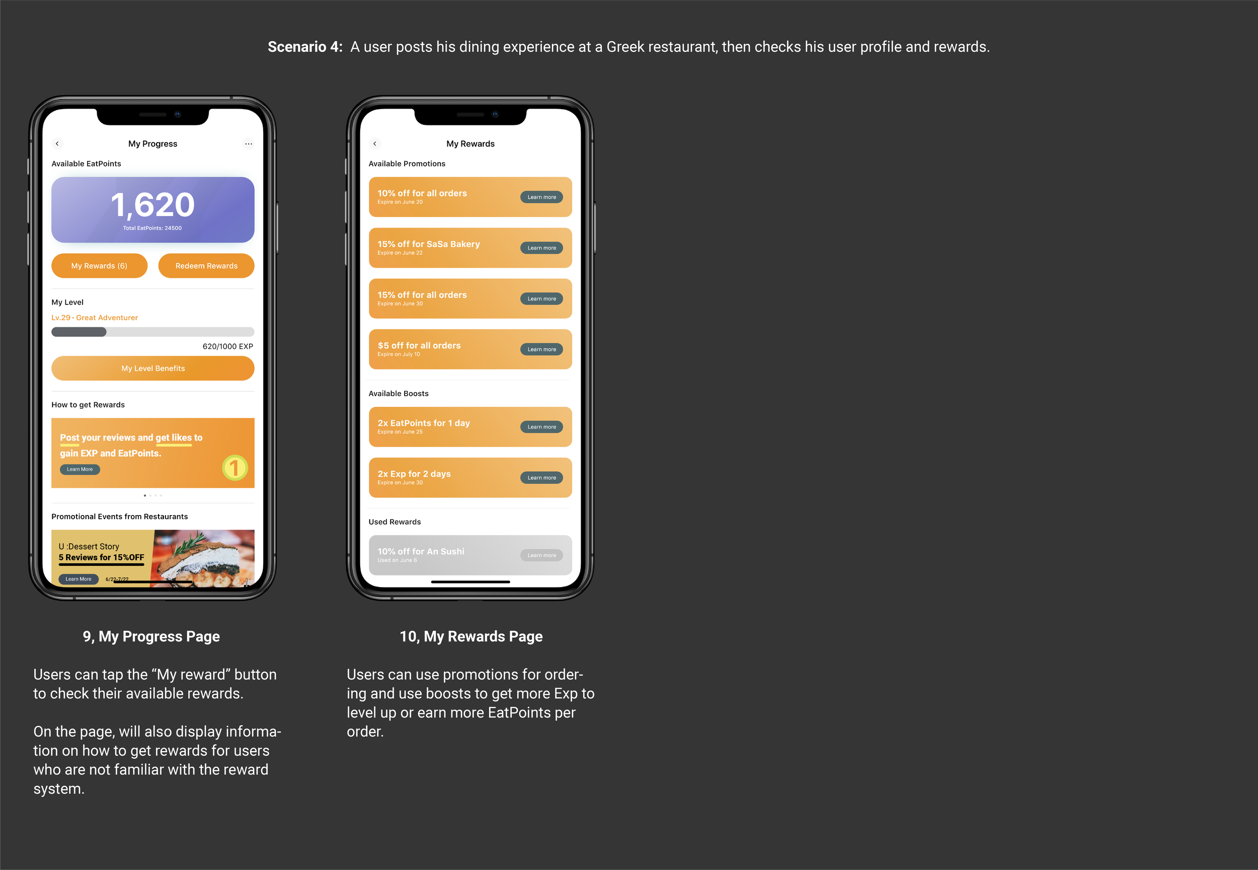
Scenario 4:
A user posts his dining experience at a Greek restaurant, then checks his user profile and rewards.
APP PROMOTION VIDEO
FINAL TAKEAWAYS
What I learned:
The marketing and competitors research has taught me a lot, including:
It helped me better understand what functions could be emphasized due to profitability and practicality.
I know what other similar apps' advantages and drawbacks are and how to differentiate my project to be stood out.
And the user prototype testing provides one of the most valuable and constructive suggestions:
It allowed me to have a more in deep understanding that any design decision has its reason behind it.
There are reasons why the buttons needed to be enlarged. And why the color and size required to be changed. They all come from user testing, and they are all to provide a more user-friendly design.
What’s next:
To move the app to a more significant step, I think it is essential to start thinking about and developing another way to remain and attract more users rather than rankings and promotions.
And put more emphasis on designing the restaurant in the community, such as posting, creating events, providing advertisements, and interactive with other users.

